Everfree
Naming the Freedom That Endures
For years, the organization known as 10 Thousand Windows served survivors of trafficking through employment pathways, economic opportunity, and community support. The name carried a meaningful metaphor, where each window opened represented a moment of possibility and freedom for a survivor.
As the organization grew and the scale of the work expanded far beyond its original horizon, that metaphor began to work against them. A name built around a numerical milestone had no way of expressing a mission that was growing in both scope and ambition, and in donor conversations it required explanations that the work itself should not have needed.
OX partnered with the organization through our Human Brands Process to develop a new name that could better represent their mission, a brand identity, and visual system that could reflect the true nature of the mission and give donors, partners, and survivors a clearer, more enduring sense of what the organization existed to do.
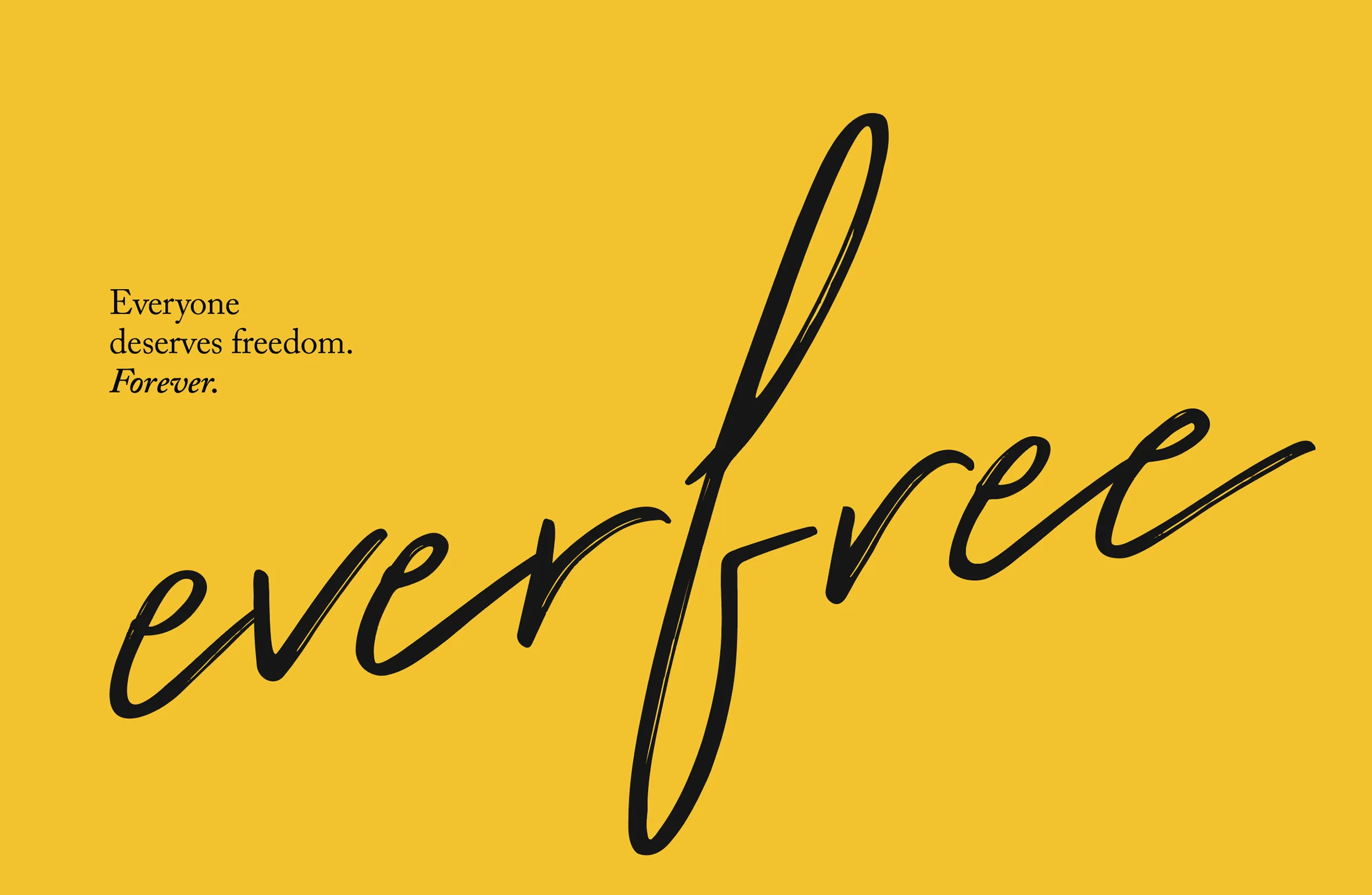
EverFree
Through ongoing conversations with leadership and board members, OX came to understand the full depth of what the organization existed to do. In the anti-human trafficking space, while much attention and donor engagement focuses on rescuing victims, this organization was working to establish long-term stability for the survivors. Their methods were highly technical and research-based so they needed simpler language to advocate that life beyond rescue was the larger goal.
That understanding led us to the name EverFree.
Where 10 Thousand Windows pointed toward a milestone, EverFree pointed toward a state of being, one that the organization exists to make permanent for every person it serves. The name gave language to the full ambition of the mission, and in doing so gave donors, partners, and survivors a far clearer sense of what the work was ultimately reaching toward.
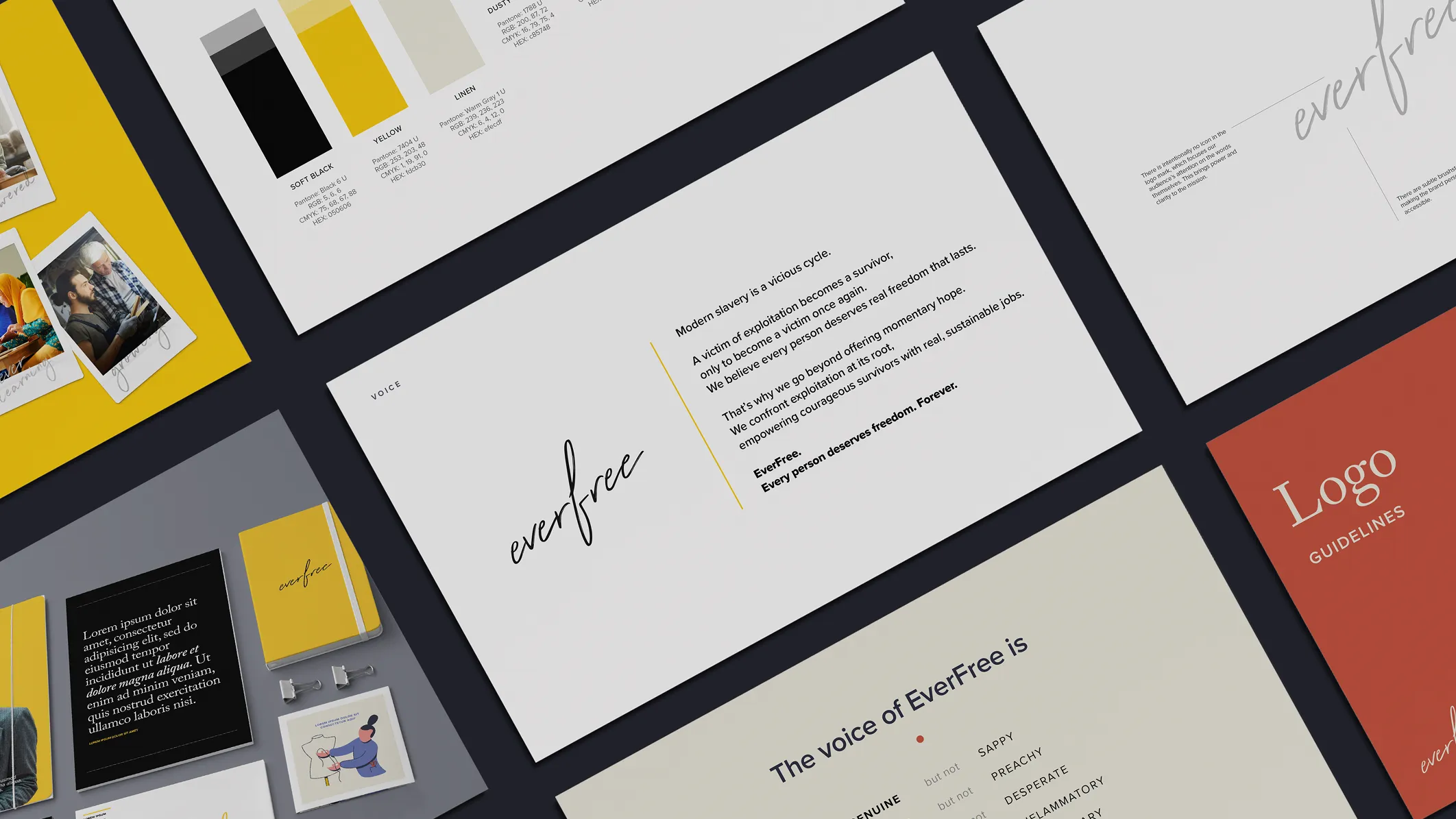
Designing for lasting freedom
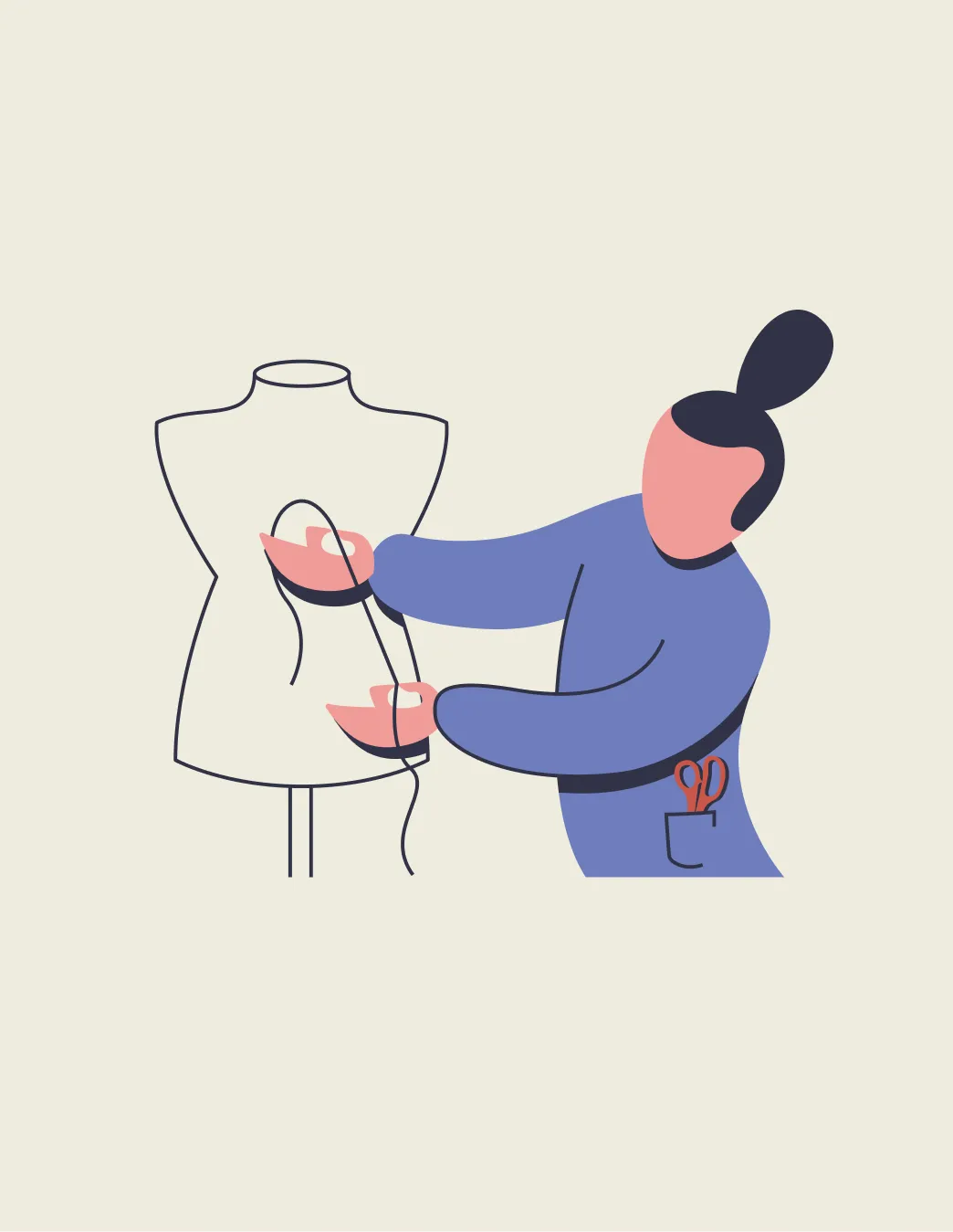
Serving survivors of trafficking requires a responsibility to protect the safety and privacy of the people the organization works with. OX developed a visual system that could communicate the depth of the mission without relying on photography of the individuals at its center. Stock photography provided a foundation, and illustration gave the brand an additional visual language, a way to tell honest and human stories while preserving the confidentiality of those it served.
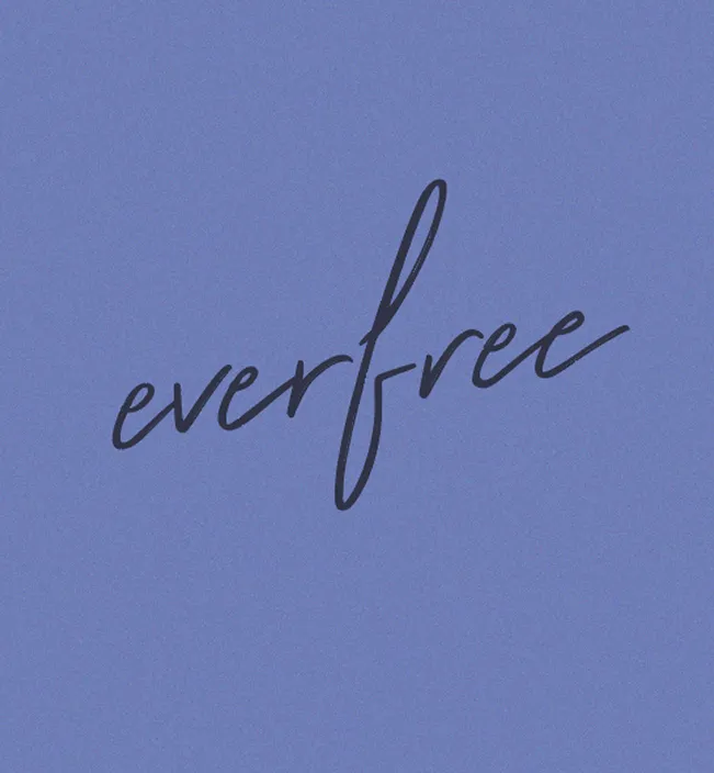
OX developed a handwritten script logo that ascends upward, loose and relaxed, with subtle brushstrokes that make it feel personal and accessible. There is no icon, keeping the focus entirely on the words and the weight they carry. The script hints at freedom, joy, and hope, and in that way the visual identity and the name work as a single unified expression of what the organization exists to create.
That identity proved its strength when the organization entered a merger with another nonprofit working in the same field. As leadership considered what name would carry the combined organization forward, EverFree remained.
Today EverFree works globally in 11 countries to break cycles of abuse and exploitation through survivor-led, tech-powered care that makes safety and healing accessible for all. EverFree co-developed and introduced a new tool in the field of survivor care in 2024, the Freedom Lifemap, that will significantly impact survivor care across aid organizations globally.


"The brand has been awesome. The name that you all came up with has served us really well. People really connect with it. They can easily understand what we do, without having to explain it. The people that we serve and our participants in our programs also really resonate with it. It feels hopeful and it gives them an identity they feel comfortable with, which you don't find in every brand name that's out there. It's worked really well."
Co-Founder & Chief Executive Officer